Machine-translated from the Chinese original. I haven't done a manual pass on this one yet.
"Welcome to the Royal College of Magic" is the title of Hortance's post on applying to the RCA — the original is in Chinese.
This one is about my first two terms at RCA's MA Service Design. The story of how I moved from business to service design and how I applied to the programme are in two other posts.
The MA runs three terms. In the first two you go through at least five projects: the icebreaker within service design, Across RCA with the whole college, the School of Design's Grand Challenge plus an elective, and Challenge Lab back in service design. Term three is the graduation project, one per programme; ours is called IRP.
London in January was pretty cold. On weekday mornings I'd walk to the Battersea campus with Headspace meditations in my earphones, then hop on the school shuttle to South Kensington. A habit I deliberately kept.
I'd been in London for nearly half a year, feeling like my life was in pieces on the floor (my journal from that time is in this post): old values getting torn apart and glued back together, over and over, all within months.
The projects, naturally, didn't stop. A master's degree just keeps going.
Icebreaking: a case study in the School of Design
The first project was the icebreaker inside our programme, a few weeks long, right after the term started. And it really is just that — an icebreaker: a low-stakes brief where you experience, for the first time, how a cross-cultural team works together and what the rhythm of communication feels like.
My team picked Tesco. This was basically the same case studies I'd done in business school for four years all over again, except this time I was "applying frameworks" with design students, so I dug out all my old analysis theories and shared them with the team.
This project left nothing in my files and notes. I didn't even save the final deliverable.
Across RCA: the college-wide mixed project
Many RCA students would say this project is terrible, but it was actually the most fun I had outside of service design, mostly because I got really lucky with teammates lol
Across RCA is a collaborative course for the entire college: students from different schools get shuffled into new groups. The five of us all came from different places: me from Service Design, Ruby from Digital Direction, Yiran from IDE (the double degree between Imperial and RCA), Nidhi from Interior Design, and Vidya from Textile Design.
We called ourselves PREP, Powering Relationships through Empathy for People.
The theme we went for was Future of Caring, and we used this almost magical method called Future Sketching to get everyone on the same page about what that future looks like: what would our roles be? How do we adapt?
After two rounds of sharing, we narrowed down to "designing for our future selves": one day we'll be the ones receiving the kind of care we were imagining, so we wanted to make something actually useful.
The proposal: starting from ourselves
In our early research we found that studies on this topic had moved from old age to aging: ageing is not a fixed state or a number, it's a dynamic, ongoing process. We narrowed things down to three intersecting threads, called it The Aged Us, and gave each thread a research question:
- Societal: how do our relationships change as we get old?
- Biological: how will our bodies change and adapt by 2050?
- Technological: how will technology step in along the way?
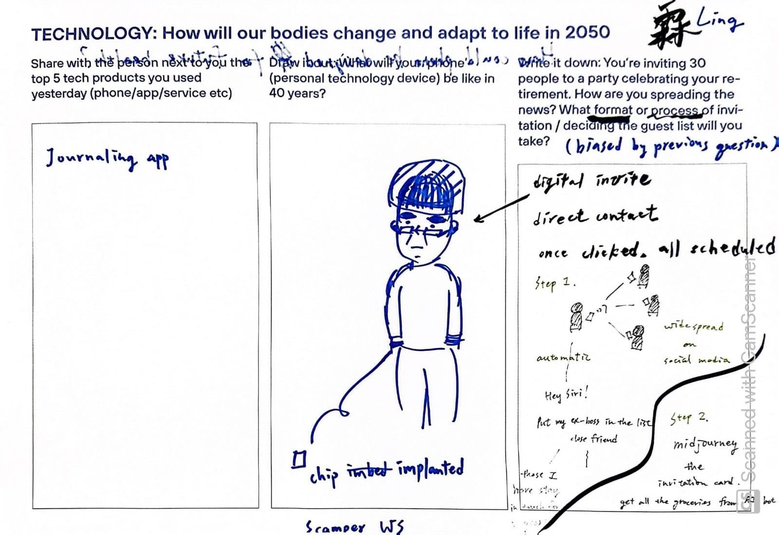
At the proposal, our tutor John gave us a push: don't just design — start from yourselves, grow your own narrative about the topic. It was the first time I was asked to think from my own experience before making anything, to build my own relationship with an issue, and to carry that awareness through the entire project.
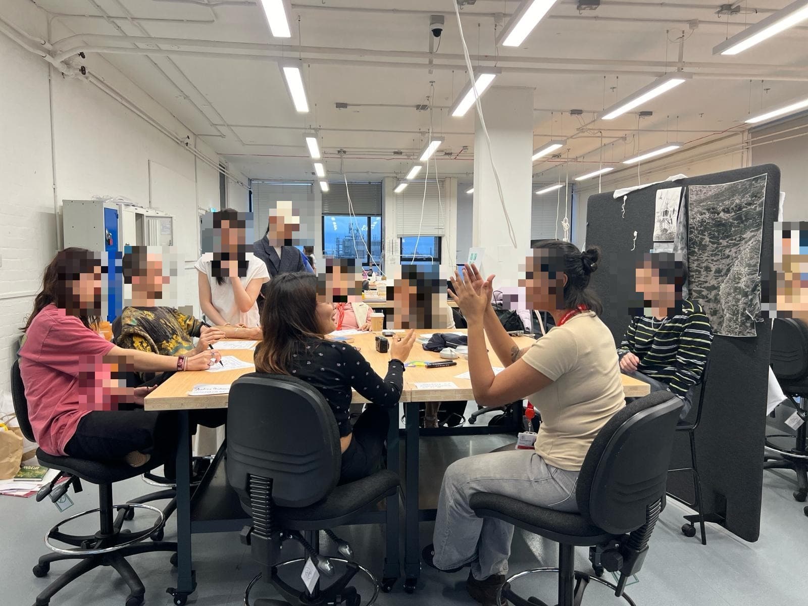
We then ran two co-creation workshops, turning our research into toolkits and sheets, so participants from all backgrounds could draw, write and talk about how they imagine ageing. Two findings mattered most. One is hesitation: a lot of people have simply never thought about this. The other is that some questions are too direct, too private. We screened the questions as a team beforehand, and still, some were so hard that participants found them stressful just to sit with.
An everyday object with meaning
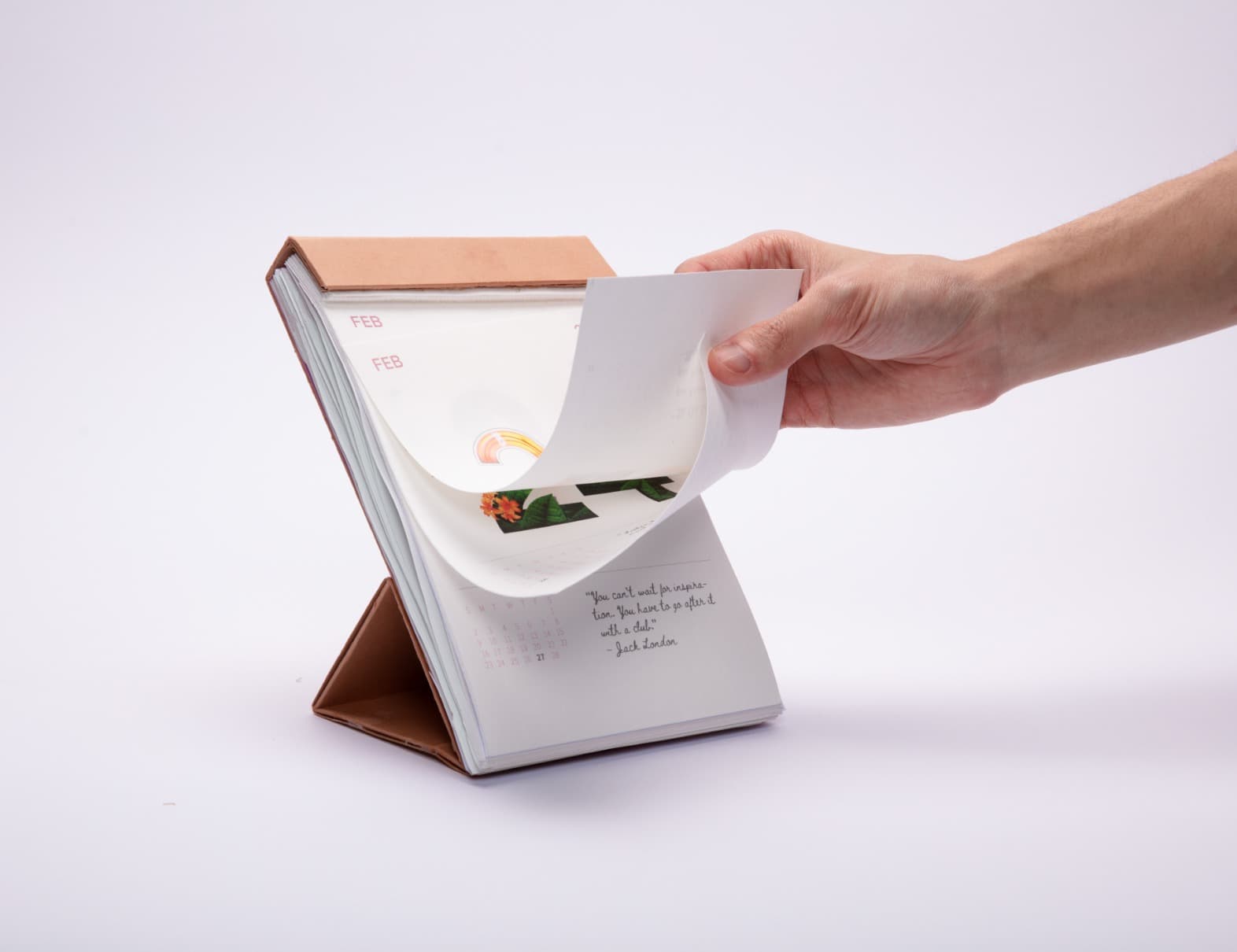
Our final outcome is The Looking Forward Calendar.
A calendar is already about counting down and looking ahead: tearing off or flipping a page is the physical act of "a day has passed".

We also wanted a daily behaviour that brings ageing back into awareness. So for the content, we drew monthly themes from our own experiences and research findings (Purpose, Physical Movement, Community, Relationships, Managing Stress), linked them back to the healthy ageing topics from our research, and designed the interactions:
- Every day you flip a page, you get one of four prompts
- An Activity Prompt, a small action to take away: "What did you want to be when you were little? Go do one thing you loved back then this week"
- A Quote, like Howard Thurman's "Don't ask yourself what the world needs; ask yourself what makes you come alive"
- A Concept, like the Japanese 生き甲斐 Ikigai
- Or a Wildcard printed on special paper: pressed flowers, embedded seeds, grainy textures
- You can tear a page off and keep it, or flip past it; the materials themselves change over time

Honestly, at first I doubted how much impact this kind of artistic approach could have. My four teammates were also people I'd never imagined myself working with, which kept reminding me of a social design project I'd done before, where I had to dig deep into what an object really means, going back and forth with product designers the entire time.
Only near the end did I get it: this is a very personal process, a deep conversation with yourself — then you distil that experience into something universal enough for others to understand. That became the final piece. Simple and poetic.
What PREP taught me isn't "cross-disciplinary collaboration skills", the easy answer. It's more about how to spot common ground across different ways of knowing, absorb them into your own thinking, and find where your practice connects with someone else's.
Grand Challenge: the School of Design free-for-all
This project is painful for everyone in the School of Design. My team had two Chinese students who couldn't speak much English, and bridging them with the other two English-only members took so much energy
Grand Challenge is the cross-programme project inside the School of Design. Our year's theme was Ocean and Cities, all about the relationship between the two. Teams were assigned: my group G95 had me, Samyuktha and Lanxi from Product Design, Mengna from Textile Design, and Lisa from Fashion Design. The borough we got was Islington — inner north London, nowhere near the sea.
After chatting with an Islington councillor, plus our own observations, we developed three ideations around surface flooding: rain garden, small rain gardens in corners of the city that absorb water, add greenery, and with the right species, support biodiversity; silt bag, reusing the silt that clogs drainage systems as fertiliser or water-retaining walls; and floating ecosystem, floating platforms made of discarded plastic bottles as habitats for aquatic species. The proposal we submitted in early December was "Urban Greenery as a solution to Surface Flooding".

The hard pivot to a physical object
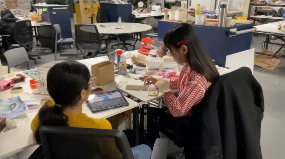
In the second term we threw the whole topic away. After the proposal, nobody had confidence or passion for it anymore, and the communication inside the team wasn't great either, so one day early in the term, we decided within two hours: let's make a physical object.
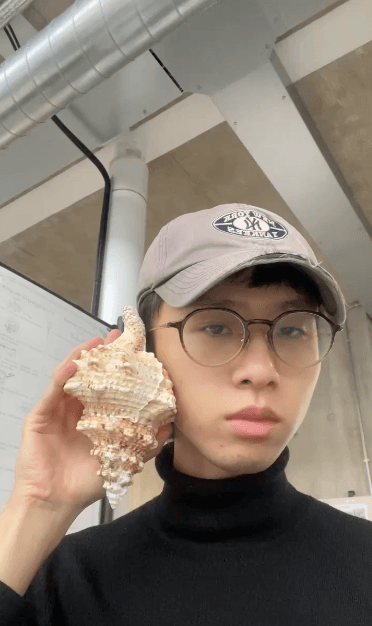
The final outcome is Shellphone, an installation that sits in pubs, in three parts: a shell-shaped handset (Bluetooth, with speaker, mic and LED inside), a printed base box (hand-written "Talk to me" on it, an Arduino generator and thermal paper inside), and an app on the researcher side that logs all the audio prompts and responses.
The interaction goes: the shell lights up and chimes on the pub table, a curious customer picks it up and puts it to her ear, and it asks a question about the ocean — "If the ocean were a person, how would you describe them?" "How many bottled waters do you use a week?" — she answers, and the base prints a little memory to take home: maybe a matching fact, maybe an AI-generated image.
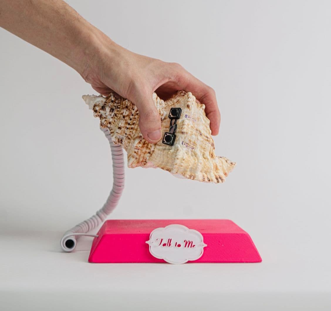
The object has two purposes: a research tool, a cultural probe for governments or researchers to collect ocean literacy data; and an installation that gets everyday people to join in and take a response home. But since we only started this concept from zero in term two, the final piece was only about 80% done.
This project was the biggest mess I got into during my whole year at RCA, mainly because of all the big personalities in the team. Lisa is the punk-style British girl you'd see in a rock band (very Vivienne Westwood, and she does fashion too lol); she and Lanxi didn't really care about the project, and Mengna wanted to but couldn't quite manage. So it ended up with me carrying the presentation and the research narrative, Sami making the product prototype work, and me taking the object to different pubs to collect user feedback.
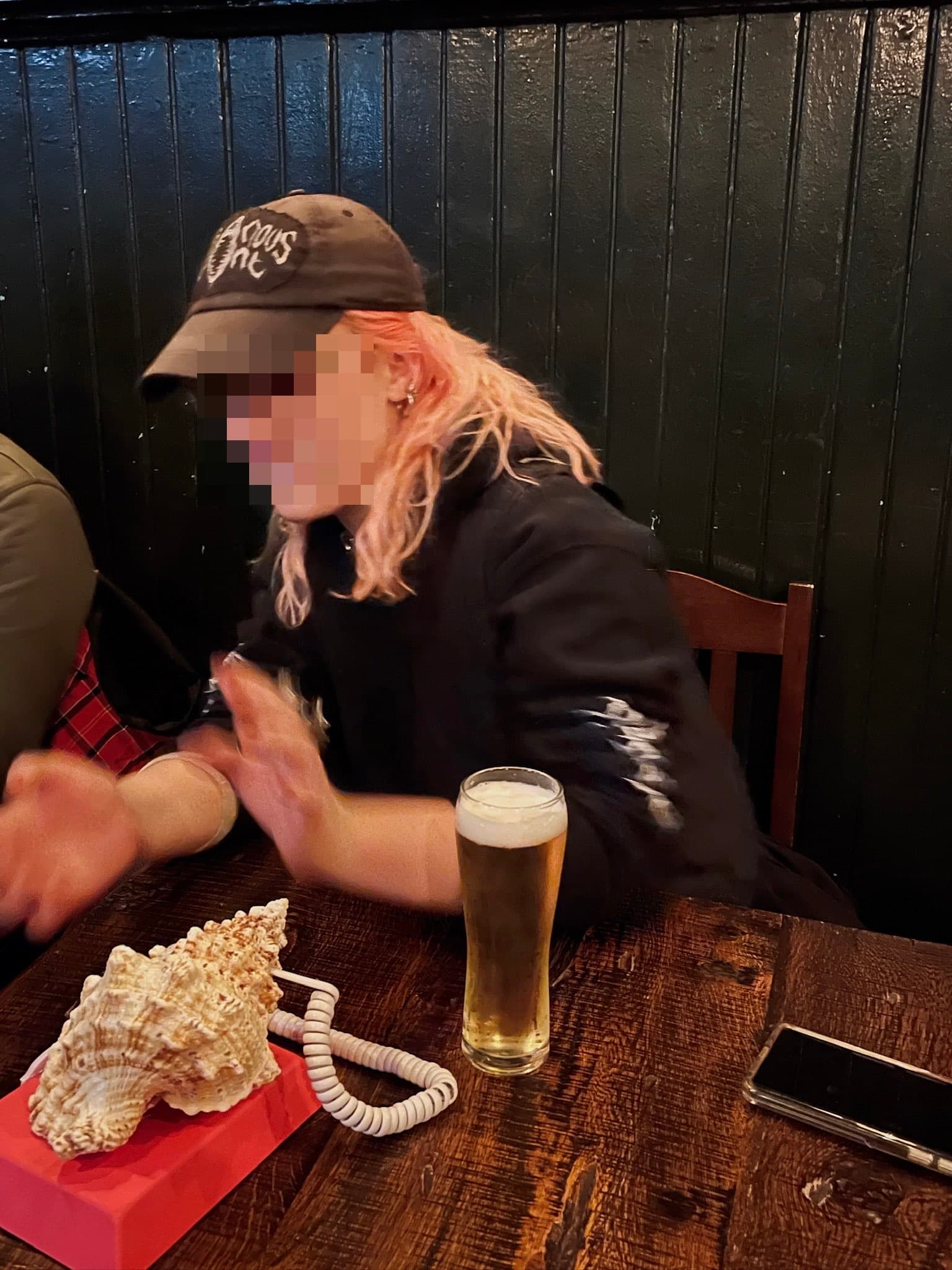
Side note: cultural probe is a concept I kept mentioning throughout this project. I first learnt it in an HCI course back at NTU — didn't expect to actually use it here.
Challenge Lab: the industry project in Service Design
This is the service design project where you choose your own topic and your own teammates — I'm so glad I worked with four excellent designers
We were grouped by the tutors' research areas, and I picked the brief with Arup (a multinational engineering consultancy headquartered in London). The core of the brief is just transition, and we spent some time unpacking the term: when a city is reorganising itself under the pressures of climate change, housing and population, how can that change be fair to everyone?

Each team picks a functional unit of the city; our entry point was London's canals.
On the canals live boat dwellers known as continuous cruisers. They have no fixed mooring and must move every fourteen days, picking up water, dumping rubbish and handling wastewater on their own as they go. Every basic need in life is tied to canal-side infrastructure that breaks down all the time.
It looks like an easy problem to solve, easy to design for. Go deeper and it's far more complicated than it looks.
Conflicts between the stakeholders
After mapping the stakeholders, we identified five main actors: the boaters, the Canal & River Trust (CRT) who manage the canals, the communities along the banks, the borough councils, and the water companies. That map later became the real theme of the whole project: the frictions between multiple stakeholders.
After talking to several of them, we landed on this: power dynamics between actors matter a lot, especially between CRT and the boaters. "Designing what, for whom" became our biggest anchor.
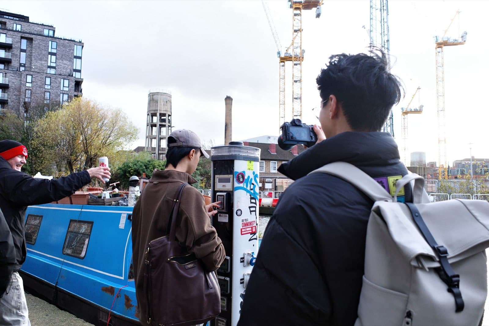
The service we proposed is called Anchor: a system with GIS and GPS that manages facilities, and collects canal data through the boaters themselves, so CRT can do repairs in real time, or even get ahead of breakdowns. The same data also becomes evidence of heavily-used areas, which in turn benefits the boaters.
Looking back at this system now from a SaaS point of view, the marginal benefit is extremely low — it would never make money. But that's the interesting part of designing for the public: what you think about isn't revenue, it's the wellbeing of a certain group of people. The "for whom" I mentioned earlier.
Choosing tools, and dropping them
We learnt a huge amount of tools and theories in the service design course, but on a real project not all of them fit, and a tool often needs adjusting for the specific field it's used in. None of these tools are new — stakeholders map, value proposition canvas, service blueprint, all from the textbook. Thinking about which one to use and how to use it precisely, I'd say, is the biggest training service design gives you.
On the Arup project we used Scenario Sketching to break the prototype into four scenarios, and tested them with different stakeholders: CRT for the public sector, NBTA for the community, and so on. A fun finding from the fieldwork: when the system is led by a different actor, similar roles inside it produce different design outcomes.

At the end of the project, I wrote down three takeaways:
- power dynamics: see the power relations between actors clearly, and find the balance in between
- invisible causes: some causes hide backstage, so abstract they're hard to analyse
- awareness of lens: are we looking at things subjectively or objectively? When information overflows, facts, claims and hypotheses mix together easily — keep them separate
End of the second term
For the first two terms I was in a constant state of "sensing the environment". I kept having this vague feeling that RCA as a whole is one giant bubble called "impact" — everyone, from every school, holds some idea of changing the world, of making a change to something.
So I kept asking myself what kind of environment it takes to grow a mature designer. I held this question against the design courses I took in Taiwan, and looked at what RCA designs differently in its courses and resources. My answer for now, still abstract: it encourages you to think about deeper root causes, and it doesn't let efficiency constrain imagination.
Meanwhile I was still in the middle of that cycle of tearing things down and rebuilding them that had been going on for six months, picking things up, dropping them, picking them up again. And then comes the third term — the graduation project.